Simplexity:
The art of making
complex things
appear simple.
The Rebrand.
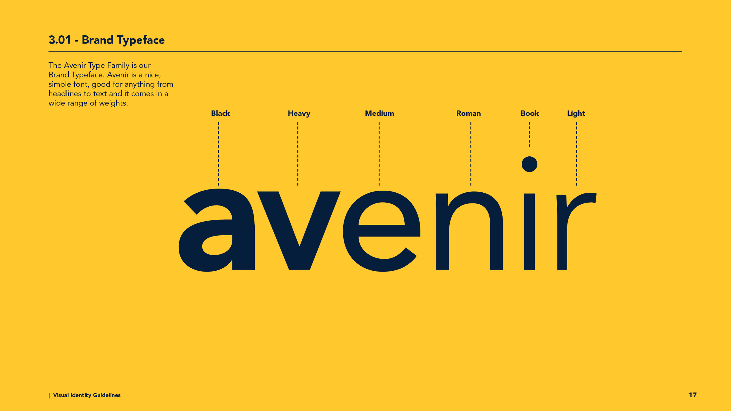
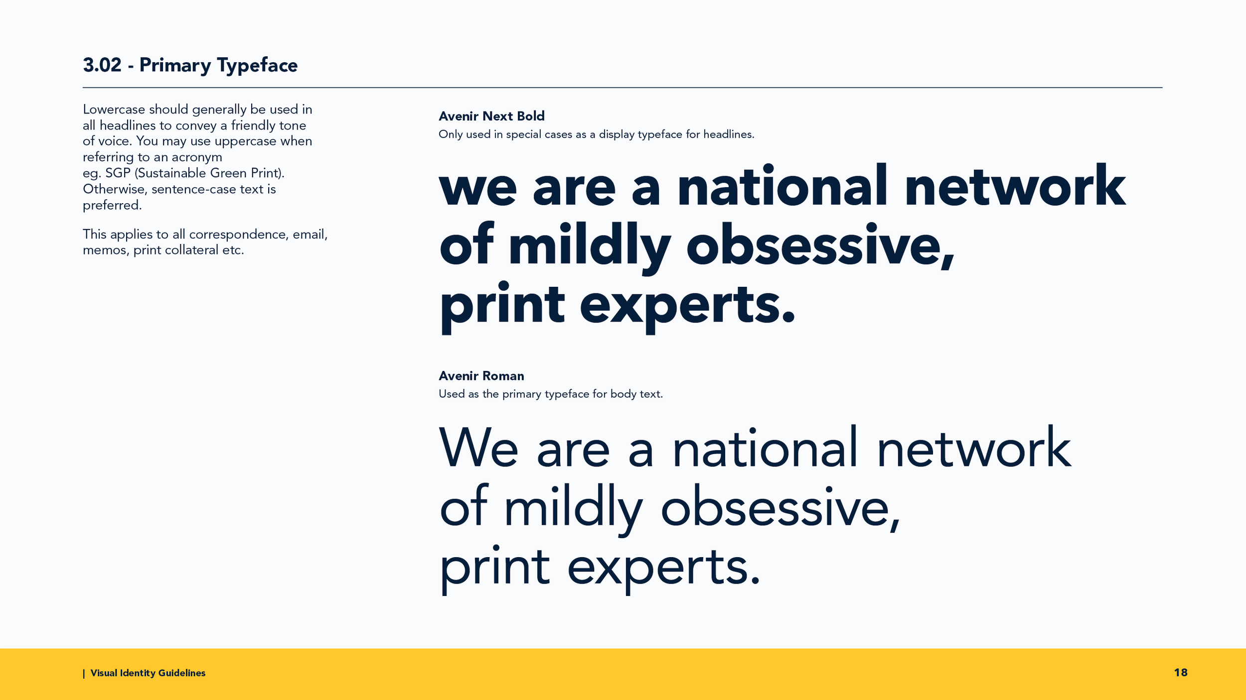
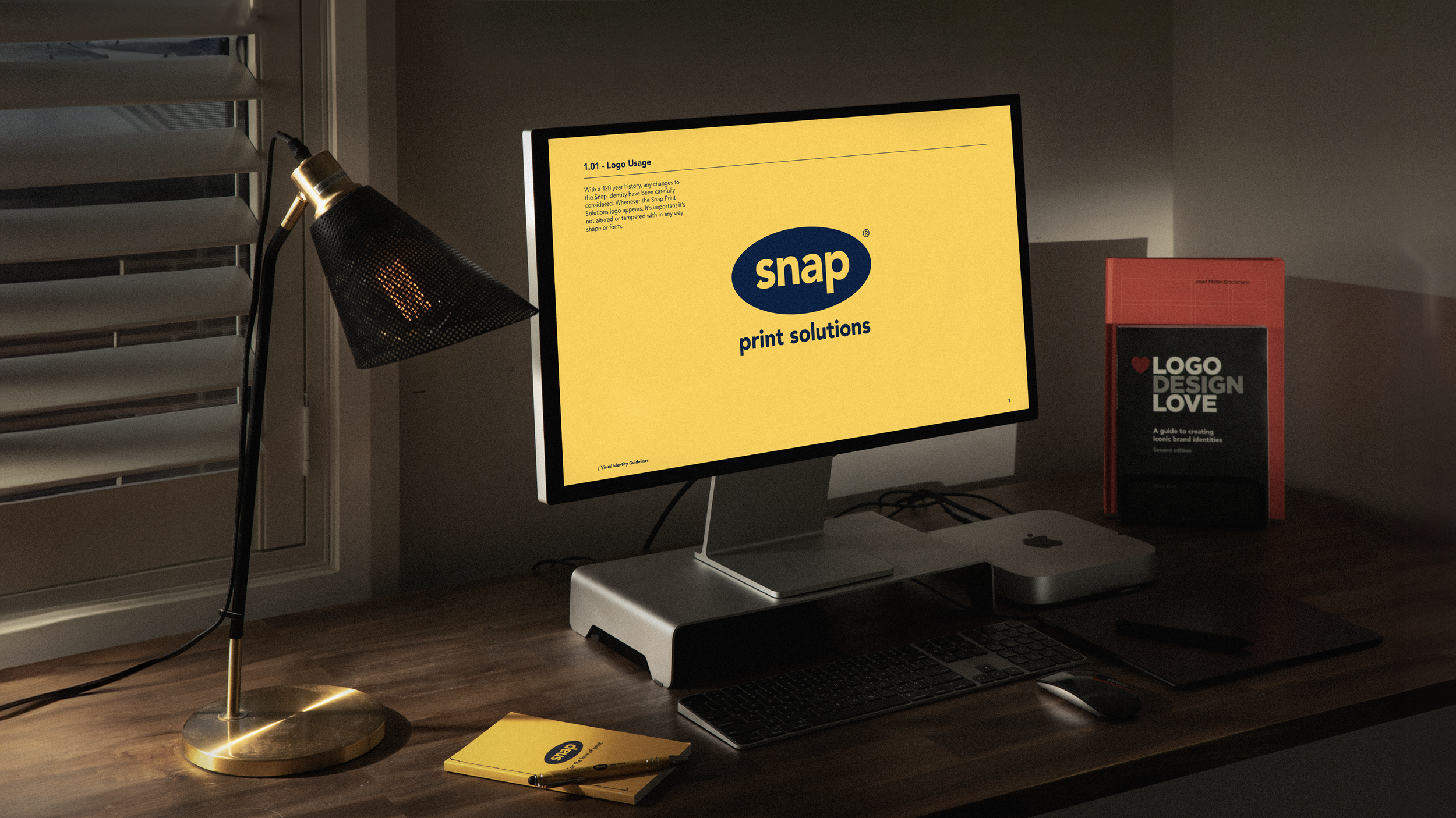
In a review of the brand identity in 2023, we chose to officially adopt the new name 'Snap Print Solutions.' The rebrand was viewed as an evolution or adaptation of the previous version. Despite having a well-developed visual aesthetic, we recognised the need for a document that would ensure clarity and consistency around key visual elements, including the brand logo, colour palette, typography, and photography.
The guidelines were also created as a useful tool for onboarding new franchise owners, staff, and suppliers.
My Role.
I wrote and designed the Snap Visual Identity Guidelines from start to finish, leading the Marketing team through a months-long process to define every detail. I ensured the document was a collaborative effort, reflective of everyone’s input and collectively owned by the team. This process involved formally documenting rules and guidelines for existing elements and establishing new ones where none existed.
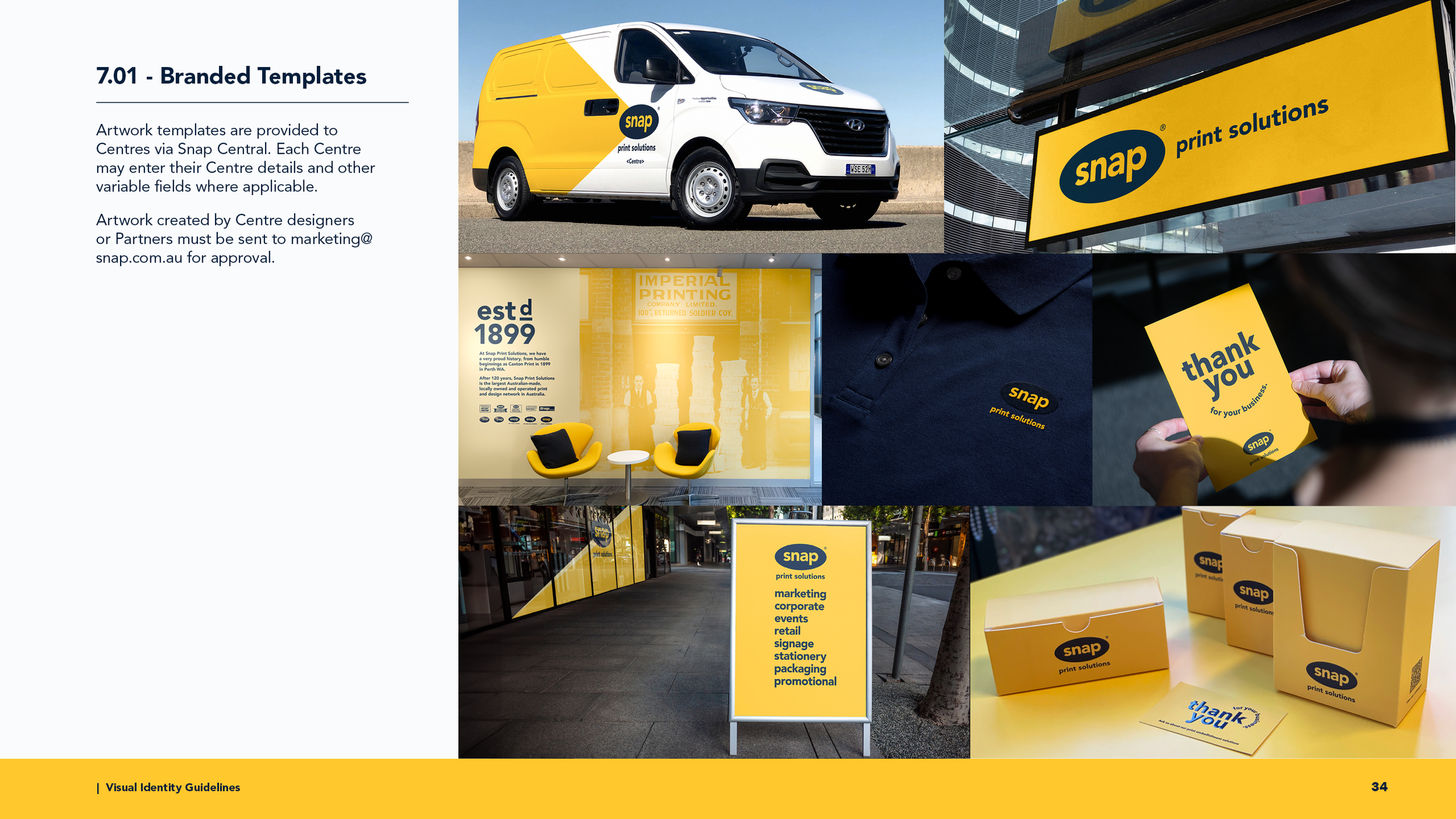
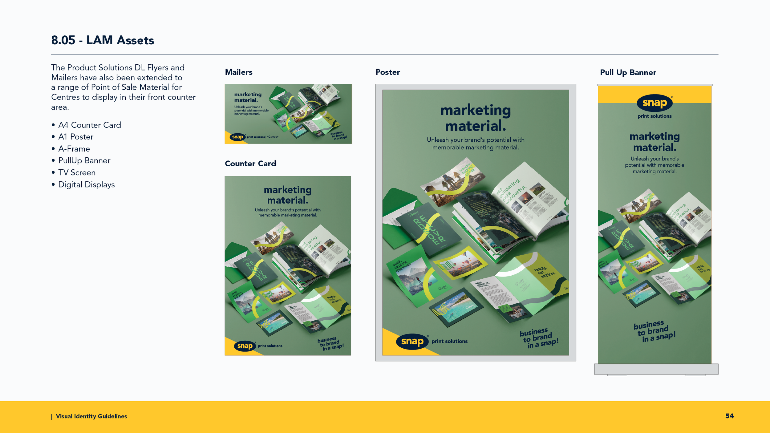
Alongside the guidelines, we rolled out an entire suite of newly branded collateral through our marketing portal. From business stationery to marketing materials, signage, and packaging, every element was updated to align with the guidelines.
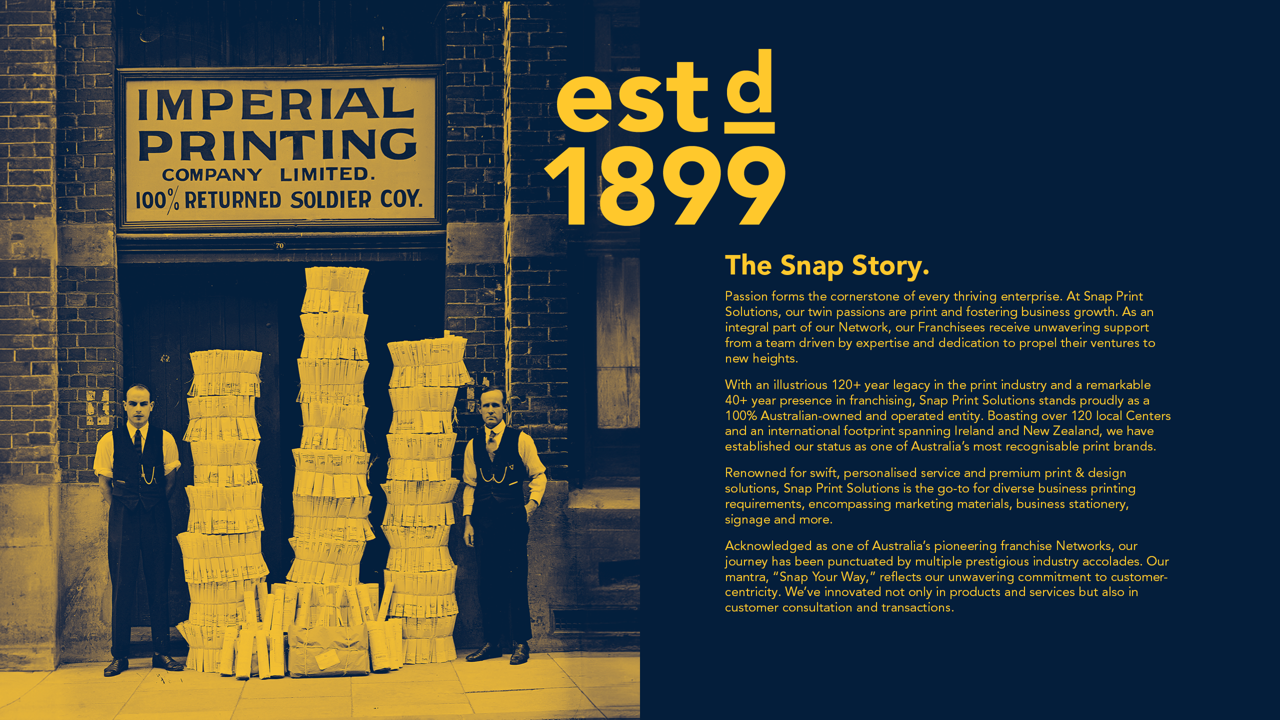
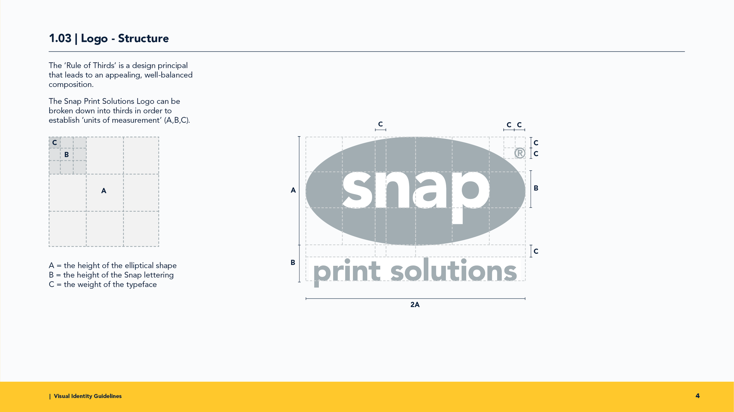
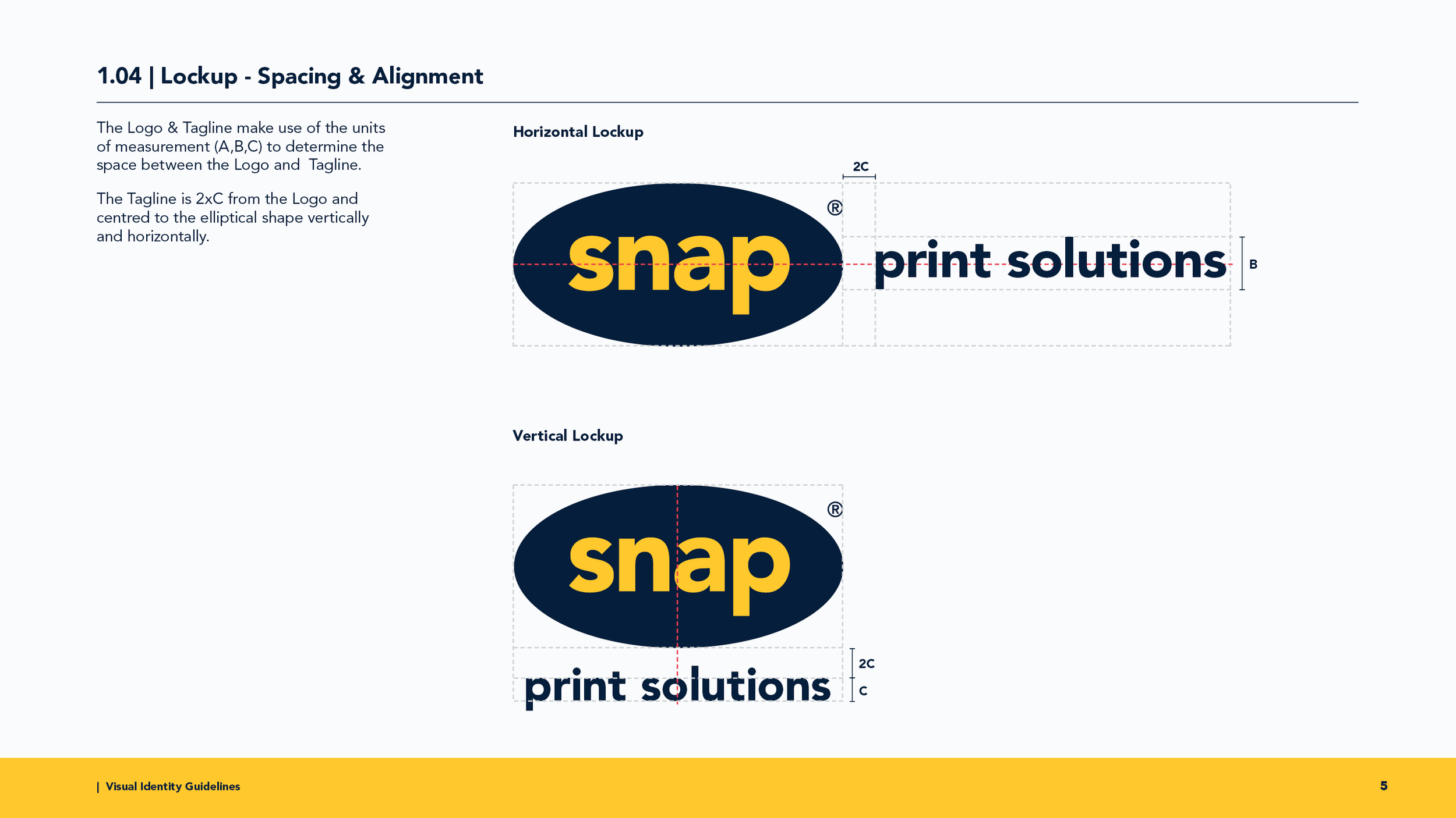
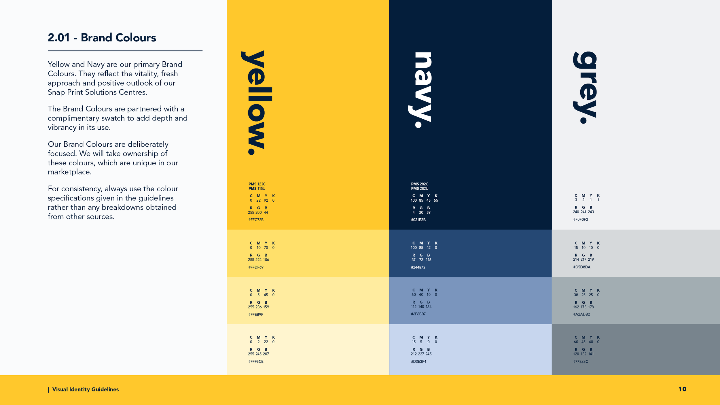
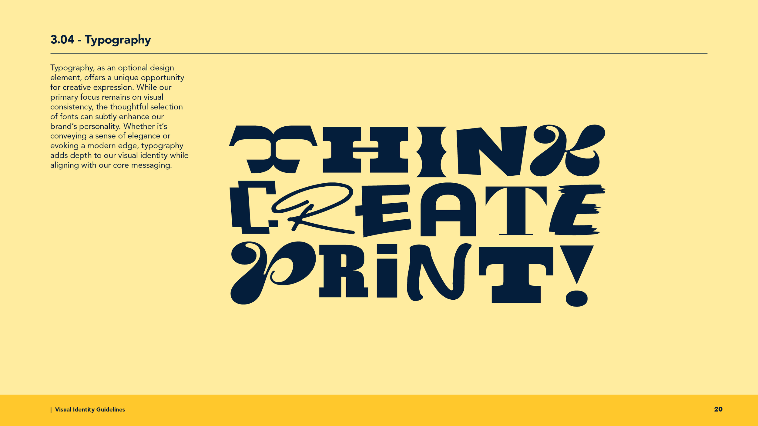
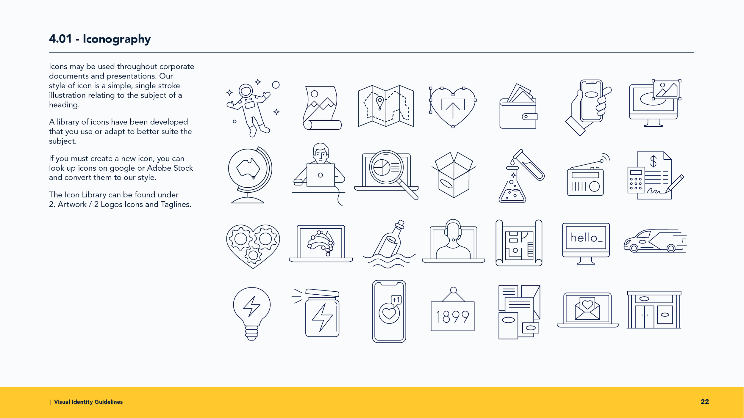
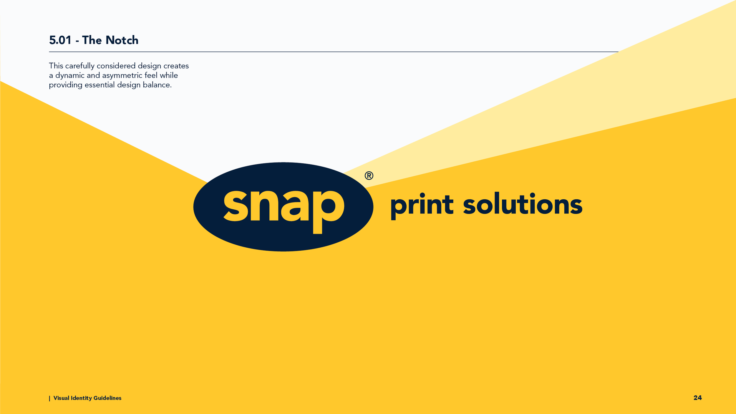
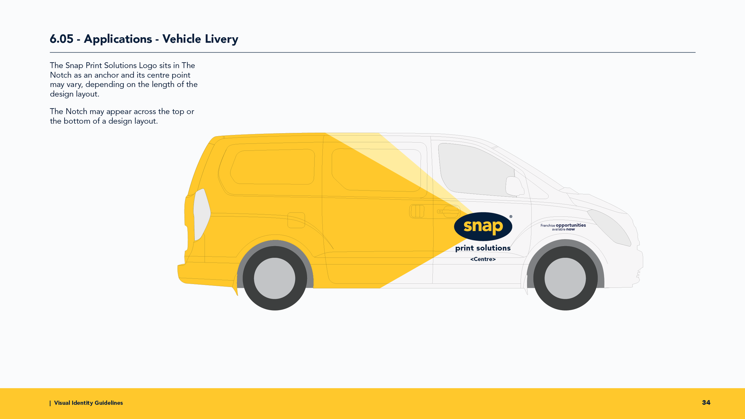
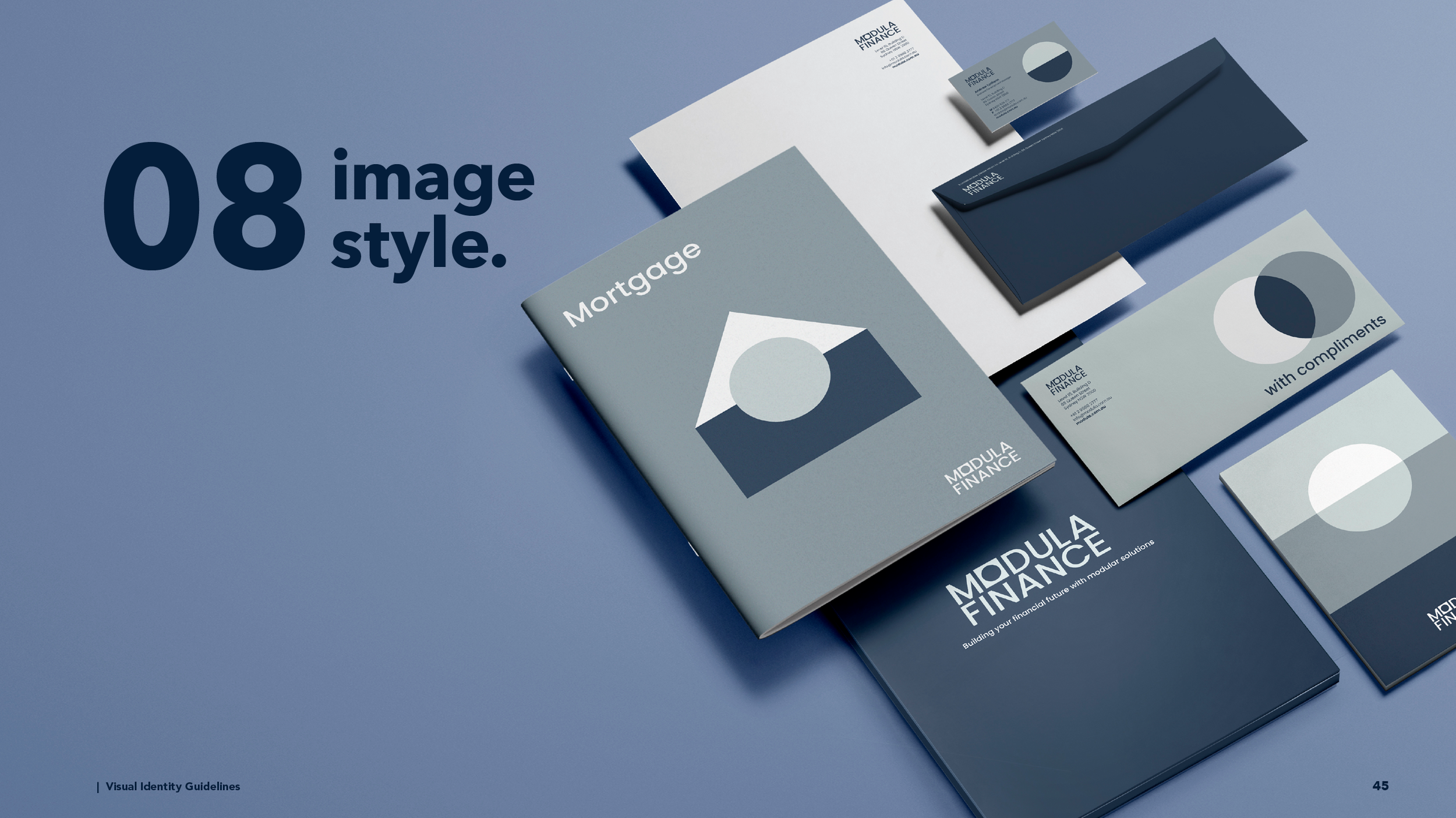
Sample pages from this document are showcased below, providing a glimpse into the careful craftsmanship behind Snap’s visual identity.
