


Care & joy woven into every little detail.
MyGuardian Rebrand.
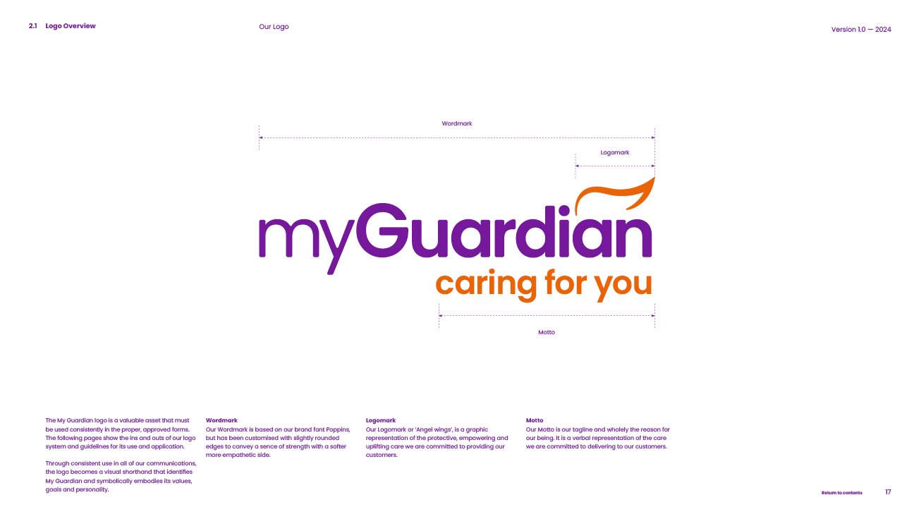
MyGuardian began its rebrand in late 2023, establishing a strong foundation with an elegant new logo mark, the motto "caring for you," and a bold primary colour palette. By the time I joined in mid 2024, many design items were already in progress, thanks to previous designers, but it wasn’t until we started applying the brand to real-life projects, like the billboards, that the potential and limitations of the existing elements became clear. This process turned theory into practice, allowing us to refine and expand the brand before solidifying the guidelines.
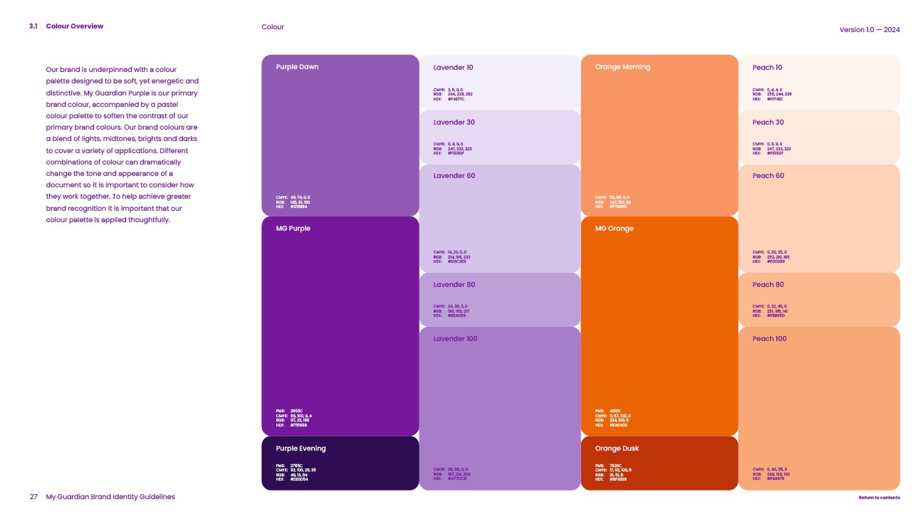
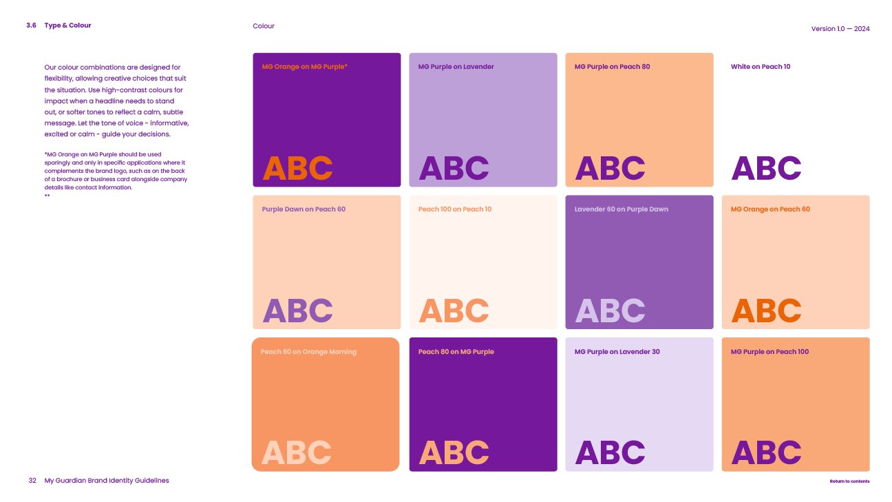
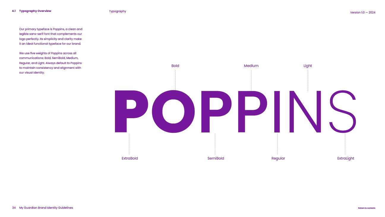
After a few short months, the result is a Brand Guidelines document that strikes the perfect balance between flexibility for creative expression and maintaining the brand's essence. It includes the foundational elements like the logo, typography, and colour palette, as well as new additions, such as a photography style, iconography library, the MG Signature and their dynamic swirl graphics. A secondary colour palette of lavender and peach was also introduced to complement the bold purple and orange, softening the overall look while keeping it modern, clean and fresh.
I played a key role in shaping the guidelines by testing boundaries and ensuring the brand worked in practical applications. Working closely with the Marketing team, I applied the brand across dozens of projects - from business stationery, marketing collateral and branded merch, to event displays, billboards, social media content and the website - evaluating how the elements performed in real-world scenarios. Once the design system was proven, the guidelines document basically wrote itself.
Sample pages from the guidelines are shown below, demonstrating how MyGuardian put care into everything they do, including design.


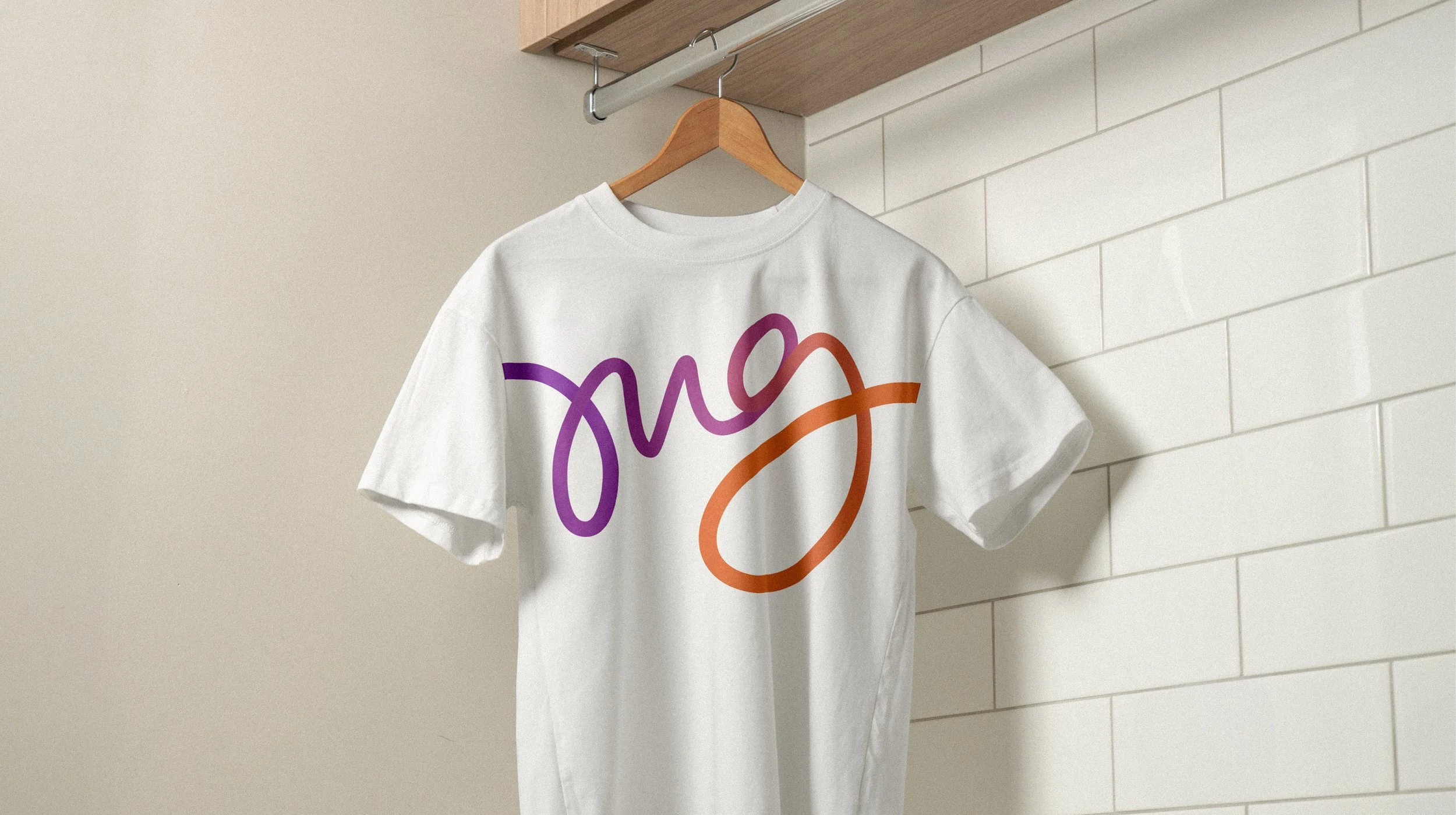
The Swirls.
The Swirls are a graphic element in MyGuardian's rebrand, designed to inject a sense of excitement and energy into the healthcare industry. The CEO’s brief was to make it feel “fun!”, helping it stand out from competitors who often focus on a more warm, caring tone. His passion for the business was clear; he wanted MyGuardian to communicate the joy and vibrancy of life, reflecting the positive impact they bring to their clients and carers each and every day.
The Swirls accomplish this by weaving through designs with dynamic motion, starting thin and purple, thickening as they loop, and transitioning to orange. This gradient stroke creates depth, movement, and a playful energy. The design allows the Swirls to interact with other elements too - circling characters, flowing through layouts, or seamlessly flowing from the MG Signature to the Wing logo mark - symbolising connection and progress.


The MG Signature.
The MG Signature is a striking and versatile feature within MyGuardian's visual identity, illustrating their dedication to a personalised approach to care with enthusiastic energy. It began as a hand-drawn concept, then recreated in Illustrator and enhanced with the same gradient stroke treatment as the Swirls.
Sometime after the design was complete, I discovered something I hadn’t noticed before: when flipped upside down, the MG Signature spells out "love" in cursive lettering. It’s things like this that make me love design! When something completely unintentional, takes you by surprise and adds that extra layer of meaning that feels like it always meant to be.

The Applications.
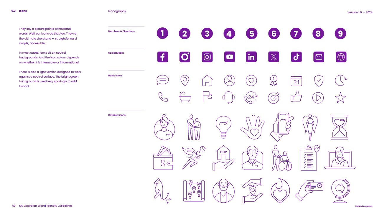
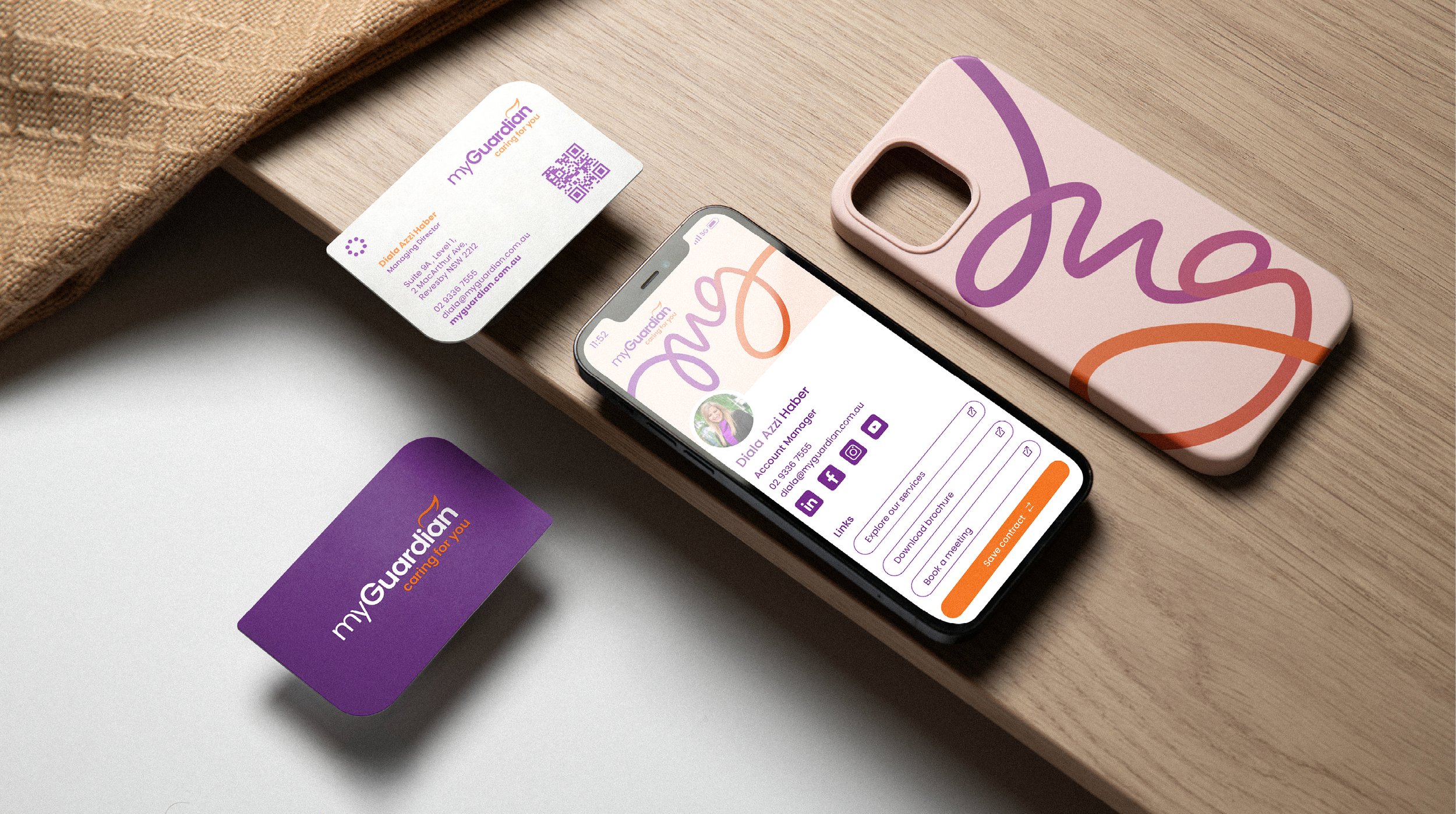
MyGuardian’s brand goes beyond aesthetics - it’s about ensuring every design choice reflects the values at the heart of the organisation. From the soft pastel colours to the elegant typography, the photography style, and the dynamic swirls, every detail has been thoughtfully designed to communicate the brand personality.
The application of this design system ensures consistency while allowing for creative freedom, creating a visual identity that feels warm, calm, and professional, yet fun and full of life. This gives the MyGuardian brand a meaningful and impactful presence across all platforms - whether big , small, print or digital.


Website.
The MyGuardian website, myguardian.com.au, became the most significant project of my assignment, pushing me outside my comfort zone to learn a thing or two about web design. When I joined in June 2024, the website already had a sitemap, wireframe, and much of the content in place. However, with the rebrand in progress and updated collateral rolling out, it became clear the site needed a redesign to align with the new visual identity.
Initially, we tried to update the existing site by simply adding the new colours and images, but it soon became apparent that a complete rebuild was necessary. Working with two developers, I led a months-long process of recreating the site in Elementor, ensuring it stayed true to the visual and functional concept I developed. Tasks and timeframes were assigned based on each developer’s skills and strengths, and progress was tracked with regular updates to management, allowing for feedback, adjustments, and additional features.
This project taught me I could manage a small team, communicate effectively with management, and keep a project organised - even though I typically work solo. It was a challenging yet rewarding experience, made possible by the trust and guidance of the CEO and marketing team, whose collaboration, vision, and incredible photography helped bring the site to life… It was truly a team effort.
Social Media.
Social media is a key strategic channel for the MyGuardian marketing team, carefully planned around a calendar of content pillars. My task was to create a distinct visual style for each pillar, which could then be converted into Canva templates for future designers to customise. This approach ensured consistency while allowing flexibility for evolving campaigns.
To visualise how these content pillars would appear over time, I developed a grid layout that revealed a mosaic-like pattern. By assigning specific colour schemes, images styles and design layouts to each pillar, the feed maintains an organised yet dynamic aesthetic. There’s an art to designing this kind of chaos - it needs to look spontaneous but remain intentional.
Additionally, I designed a range of social media banners, aligning them with the billboard campaign and integrating key brand elements like the MG Signature. These banners were adapted for Facebook, Instagram, LinkedIn, and YouTube, reinforcing the brand’s visual identity across all channels.

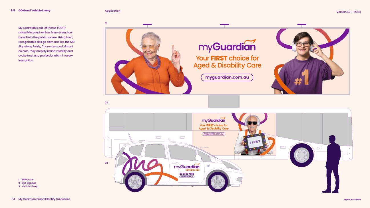
Out-of-Home Advertising.
The billoboard advertising campaign was the first project I worked on at MyGuardian, laying the groundwork for the brand’s refreshed identity. With over 20 locations booked across Sydney for six months, this was a high-priority task and a major test case for refining the brand. Through multiple iterations, we landed on a look that incorporated the soft peach secondary colour, dynamic Swirls, and character photography from our own photoshoot. The use of in-house photography was a defining moment, moving away from stock imagery and adding an authentic, personal touch to the brand.
The final design reflected the CEO’s vision of a vibrant and celebratory aesthetic. The campaign’s success was immediate, driving a surge in website traffic and creating urgency to align the website to the updated look.
The billboard artwork was adapted across various formats, including digital billboards, bus signage, shopping centre displays, and trade show stands. While elements of the brand continued to evolve, the billboards remained the benchmark for all subsequent designs.

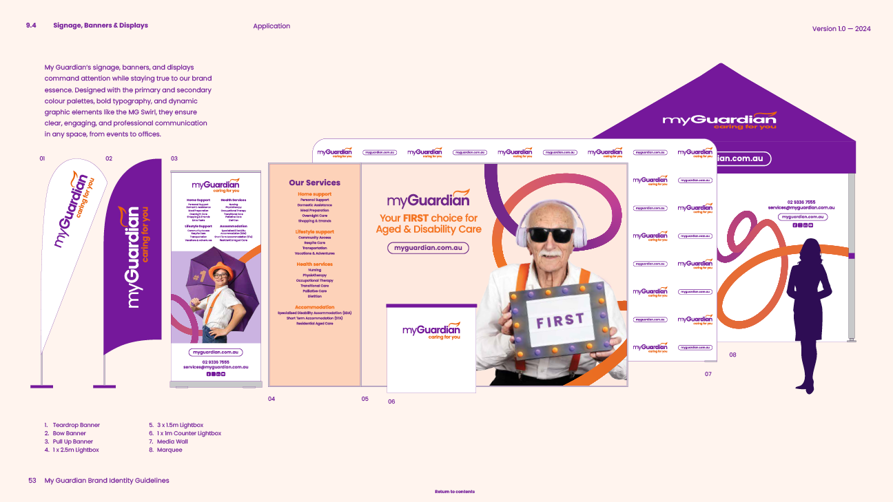
Event Displays.
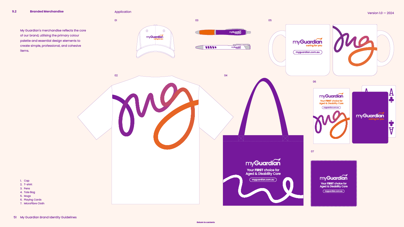
MyGuardian’s event displays are designed to stand out, featuring bold backlit walls that measure 2.5m high and span widths of 3m to 9m. These displays, combined with backlit counters, tablecloths, media walls, marquees, umbrellas, banners, tote bags, branded merch, and marketing collateral, create a professional and engaging presence at expos, trade shows and events.
Events are a key part of MyGuardian’s marketing strategy, providing opportunities to connect with potential clients and network with industry professionals. Each event focuses on specific services, such as the Disability Care Expo or the Seniors Expo, while others, like the Care Expo, allow a broader showcase of MyGuardian’s services.
During my time at MyGuardian, I developed a variety of display configurations to suit different booth sizes and event focuses. Each design was tailored to maximise the space available while aligning with the brand’s visual identity and delivering a clear, impactful message.
Vehicle Livery.
The vehicle livery concept for MyGuardian is a bold and effective way to extend the brand’s presence through out-of-home advertising. Featuring the logo, contact details, and the striking MG Signature, these designs are created to make an immediate impression. Whether on small vehicles, mid-size SUVs, or commute vans, the vibrant branding captures attention and reinforces MyGuardian’s visibility.
Vehicle livery is a strategic addition to the marketing toolkit, targeting not just the elderly or people with disabilities but also their loved ones who may be seeking care services. The large MG Signature, prominently displayed, creates a sense of energy and movement, aligning with the overall brand identity. These vehicles, seen by commuters on their daily travels, have the potential to significantly boost brand awareness and connect with a wide audience.
Currently conceptual, the vehicle livery designs have been created to scale and are ready to come to life. I can’t wait to see these vehicles on the road, turning heads and delivering MyGuardian’s message to people on the move.